





WE USE COOKIES
Cookies help us deliver the best experience on our website. By using our website, you agree to the use of cookies. Find out how we use cookies.

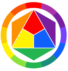
Colour is an object’s appearance as a result of how it reflects light off a surface. People may see the same colour slightly different because of the way our eyes transmit messages to the brain, which produces familiar sensations of colour. Colours affect our mood and perception.
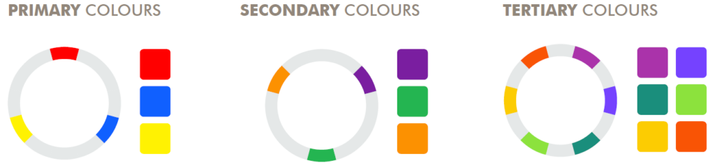
In colour theory, colours are organised on a colour wheel and grouped into 3 categories: primary colours, secondary colours and tertiary colours.
SECONDARY COLOURS
Secondary Colours are produced by mixing two primary colours.

COOL/ OCEAN COLOURS
This colour combination resembles the sky, snow and water. Cool colours which are found on the right side of the colour wheel, tend to appear more calm and relaxed.

TERTIARY COLOURS
Tertiary Colours are produced by mixing a primary and secondary colour.

WARM/ EARTH COLOURS
This colour combination resembles warmth, sunlight and earth. Warm colours which are found on the left side of the colour wheel, tend to appear more active and energetic.


Hues, Tints, Shades & Tones are terms that describe individual colour mixing processes.
• Tint is a mixture of a colour with white, which increases lightness.
• Shade is a mixture with black, which increases darkness.
• Tone is produced either by mixing a colour with grey, or by both tinting and shading. The result is a reduced saturation, or colourfulness, while the hue remains the same.
• Value refers to the lightness or darkness of a colour. It indicates the quantity of light reflected. When working with pure colour (hue), value can be affected by adding black or white to a colour. Adding white to a colour produces a tint and adding black to a colour produces a shade. When grey is added to a colour, the intensity of the colour is changed.
COLOUR SCHEME:
The choice of colours used in various artistic and design contexts.

MONOCHROMATIC
A monochromatic colour scheme is a combination of different shades, tones and tints of the same hue. As a result, the energy is more subtle, simplistic and peaceful due to a lack of contrast hue.

ANALOGOUS COLOURS
Analogous colour schemes use colours that are next to each other on the colour wheel. They usually match well and create serene, comfortable designs.

COMPLEMENTARY COLOURS
A complementary colour combination is a combination of shades, tones and tints between two opposite colours on the colour wheel. This colour combination is striking yet appealing and simplistic.

ARBITRARY COLOURS
A random selection of colours that are in no particular relation to each other. This colour combination may include any shade, tint or tone of colour, with no limitations on the amount of colours that might be included.
WHICH COLOUR COMPLEMENTS YOUR SKIN TONE?
It’s not a rule that certain skin types may only wear certain colours, it is generally accepted that ‘cool’ complexions are complemented by wearing ocean (spring/summer) colours and ‘warm’ complexions are complemented by wearing earth (autumn/winter) colours.